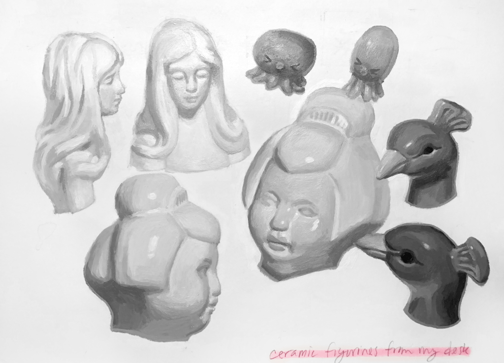
When I’m working on projects in my sketchbook, I often like to make notes to see where I’m at. I painted this sketchbook page of the faces of figurines I keep in my room. In this post, I’d like to write about what I learned.
On accurately representing the lighting on these figurines:
- It’s best to reserve the lightest values until later. Painting light values with a little gray ensures creates the contrast to make the highlights stand out.
- Light source matters. Having a very bright light shining on the paper leads me to unintentionally choose colors darker than I want, as they look deceptively lighter under the light. Next time, I’ll choose a less bright light, or move my light source further away.
On the initial drawing:
- If I’m meaning to cover the drawing entirely with paint, it’s best to draw simple shapes. This makes me less afraid to move away from the lines as I paint. I sketched these out just enough to know where the parts of the figurine were. I might try making the pencil lines in straight lines only, to put the focus on getting the proportions down better than here.
On acrylics as a medium:
- Painting with more water on my brush let the paint blend more, although it was still tricky to mix halftones. I had to redo sections to create softer edges.
- I prefer to not use extra mediums or add-ins, just to have less supplies to manage, but I need to keep my options open as painting in color will be trickier to blend than this.
- On the edges of each figurine, painting a line slightly lighter than the shadow side on the edge, along places of shadow. It lessens the contrast between the shadow and the white of the paper.
- The paint is more dimensional than I’d like, and sometimes looks grainy. This appears mostly on the sections I went over several times.
I really am happy with how this turned out, and I definitely am interested in making more paintings in this style, with strong value contrast but softer transitions between colors. This picture is lower quality than in my other posts, since I don’t have access to a scanner now that my campus has closed down for the semester.
I plan to make some future posts about sketchbook pages- maybe this could be a series! It would be fun to write.
