“One is quite astonished to find how many things there are in the landscape, and in every object in it, one never noticed before. And this is a tremendous new pleasure and interest which invests every walk or drive with an added object. So many colours on the hillside, each different in shadow and in sunlight…
Such brilliant reflections in the pool, each a key lower than what they repeat; such lovely lights gilding or silvering surface or outline, all tinted exquisitely with pale colour, rose, orange, green, or violet. I found myself instinctively as I walked noting the tint and character of a leaf, the dreamy, purple shades of mountains, the exquisite lacery of winter branches, the dim, pale silhouettes of far horizons.
I think this heightened sense of observation of Nature is one of the chief delights that have come to me through trying to paint. Happy are the painters, for they shall not be lonely. Light and colour, peace and hope, will keep them company to the end, or almost to the end, of the day.”
Winston Churchill, Painting as a Pastime
That excerpt was from a short book I had found at my local library. I hadn’t known before that Churchill was a painter, and I enjoyed reading it! The very end may be very idealistic (because real life is complicated), but I like the sentiment. I’ve experienced myself what Churchill talks about here, and here’s a few thoughts on what things to try, in my own experience, in improving your skills in painting and color planning.
- Research! There’s a lot of books written about color theory, from Johannes Itten’s book, written around the time of the Bauhaus, to the variety of books, blog posts, and media posts available online. However, I don’t recommend hoarding information and never using it. I do recommend looking at a variety of sources, both modern and much older, to hear a variety of voices on the subject. If you’re looking for hard-to-find books or resources, check your local library! There’s likely ways to ship titles to your local branch for checkout, such as an Interlibrary Loan (if you’re in the US like me). Just remember to leave the research tunnel vision behind at some point and sit down to make some art.
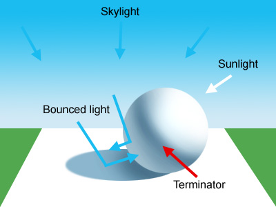
Below image: a very helpful image from Light for Visual Artists by Richard Yot. I recommend this book. As color and light are naturally very connected, having good skill in drawing objects/things in grayscale will most certainly help you. Note the color of the shadow: there’s a reason it’s blue…
- Sharpen your skills of observation. Try to identify the colors of objects around you, the colors of their shadows. No color in real life is flat, there are gradations everywhere: observe how the lightness or value of an object or plane moves lighter as it gets closer to a light source, or the opposite as it moves farther away. It can be a fun game, to guess the colors of shadows. Not an easy one either. And remember that colors can lean to cool or warm in temperature.
- Build a memory bank. Certain colors or color schemes can evoke emotion, and this is key when you want to communicate a certain feeling in a piece. And I don’t mean in the simplistic form of red being associated with anger, or blue with calmness- it can be more personal than that. For example, very pale light blues and greens make me think of cool spring and summer days, because of my own memories of times I saw those colors. I’ll remember for the longest time how when I would sit on the second floor of the Crane building at CCAD on warm days near the end of semester looking out the windows, and it looked as if the sun had lit up the grass down below a liquid neon green (and I used this neon connection as part of a piece once). Or seeing the sunrise light up skyscrapers pink and orange, while behind sits a light blue sky waiting to appear. I could go on and on, since color choices can often be very personal and you can use your own experiences to inform what you choose to paint.
- Lastly, start simple. Don’t throw yourself into a painting or drawing containing twenty different theme colors that all change like a broken weathervane. I recommend doing simple images at first, focusing on two colors at a time, such as complementary colors. This will give you a chance to practice and use your observations and research in the form they were meant to be.
That’s all for this one, although I have a lot more I could continue on from here. That would have to be for another day!
